
Ready to take interactive check boxes further? Check out Alesandra Blakeston’s post on Interactive Charts.
..and click here to view earlier post: Automating the Spreadsheet using Check Boxes, DSUM
Occasionally you need to deal with years and years of data across multiple data sets. Seeing all of that data in one chart is distracting and difficult to read. One of the best ways to get round that (IMHO) is to add some simple interactivity to your chart.
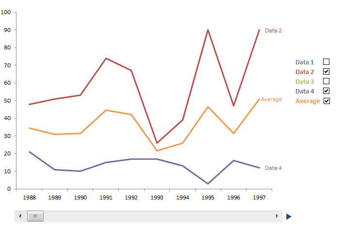 Obviously this is a static picture, but you can add scroll bars and check boxes to your excel sheet very easily. I originally learned how to do the check boxes from Peltier Tech, the scroll bar I worked out for myself after seeing how the radio buttons worked, though I am sure he’s got the how to on there as well.
You can download the sample worksheet here.
Step 1: Prepare your data
First you need to work out what time range you want the chart to show. I chose ten years, but you can set (almost) any time range you want.
View original post 1,058 more words
