Histogram
After completing the J.P. Morgan Corporate Challenge 5K race I was curious: how many other runners had a similar finish time as I? What an Excel-lent opportunity for a Histogram!

A Histogram analyzes values, groups those numbers into bins, (population frequencies) of your choosing, and displays that data in a table or chart. The Histogram tool is part of the Data Analysis Toolpak. It may not initially appear on your ribbon, but is a cinch to install.
Adding the Data Analysis Toolpak
- On the Ribbon, click File, then Options.
- Click Add-ins.
- On the Manage drop-down, select Excel Add-ins and click Go.
- Select Analysis Toolpak and click OK.
For a simple Histogram, here’s what you will need:
- Input Range: cells containing values to be reviewed. The range must be sorted in ascending sequence.
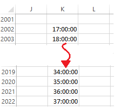
- Bin Range: cells to act as virtual bins within which Excel will place matching numbers. For example, a teacher grading a test might use Bin values for the test scores she wants to lump together. Bin range is an optional; if left blank, Excel will create Bins.In my example (below) the Bin values are increments of one minute, between 17 and 37 minutes (the fastest and longest finishing times).
- Output: Location for the Histogram table. These options include Range, New Worksheet, and New Workbook.
- Chart Output: (optional) charts the Histogram table output.
Creating the Histogram Table and Chart
- On Data tab of the Ribbon, click Data Analysis. The Data Analysis dialog appears.
- Select Histogram and click OK. The Histogram dialog appears.
- Select or enter the Input Range (e.g., E11:E2804) , Bin Range (e.g., K13:K32), and Output range (e.g. M12).,
- Check Chart Output.
- OK.
To download the sample file click JPM Corp Challenge (SF) Results
Watch this ~4m video to learn more.
Cheers!
hɔuᴉnb
Related posts:
- Using DSUM
- Adding Check Boxes
- Linking the Check Box to a Cell
- Formatting Indents in Excel
- More Excel Tips
Comments and questions are always welcome!

One thought on “Using Histogram for Data Analysis”