
One small step for a drone, one giant leap for,..well, a drone.
Godspeed, Rosetta/Philae!
Category: Tech
Asus To Begin Selling Android Wear-Powered ZenWatch In The U.S. Nov. 9

To borrow from ‘Taylor Swift’, We will never ever ever …wear an iWatch (despite how cool we secretly think they look). So we are really excited by the new #androidwear coming out in time to vie for your holiday bonus bucks. Here’s a peek at the ASUS model, expected in to hit stores next week.
Researchers Send Robotic Penguin Babies In To Monitor Real Penguins

Scientist use robotic penguin to get up close and personal to nesting penguin colony.
Yes, the science is great, so do read the article. Then check out the video to get your baby penguin fix (trumps the cat video meme, hands-down)!
NaturalCycles Expands Its Contraception App Subscription Service In Europe

Contraception? Of course there’s an app for that, too!
Many apps offer family planning tools for couples looking to conceive. This Swiss startup, NaturalCycle, is using that data to help individuals engage in sex that does not result in pregnancy.
Now offering free trials, read on for more
Using Histogram for Data Analysis
Histogram
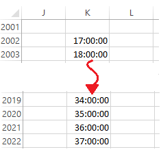
After completing the J.P. Morgan Corporate Challenge 5K race I was curious: how many other runners had a similar finish time as I? What an Excel-lent opportunity for a Histogram!

A Histogram analyzes values, groups those numbers into bins, (population frequencies) of your choosing, and displays that data in a table or chart. The Histogram tool is part of the Data Analysis Toolpak. It may not initially appear on your ribbon, but is a cinch to install.
Adding the Data Analysis Toolpak
- On the Ribbon, click File, then Options.
- Click Add-ins.
- On the Manage drop-down, select Excel Add-ins and click Go.
- Select Analysis Toolpak and click OK.
For a simple Histogram, here’s what you will need:
- Input Range: cells containing values to be reviewed. The range must be sorted in ascending sequence.
- Bin Range: cells to act as virtual bins within which Excel will place matching numbers. For example, a teacher grading a test might use Bin values for the test scores she wants to lump together. Bin range is an optional; if left blank, Excel will create Bins.In my example (below) the Bin values are increments of one minute, between 17 and 37 minutes (the fastest and longest finishing times).
- Output: Location for the Histogram table. These options include Range, New Worksheet, and New Workbook.
- Chart Output: (optional) charts the Histogram table output.
Creating the Histogram Table and Chart
- On Data tab of the Ribbon, click Data Analysis. The Data Analysis dialog appears.
- Select Histogram and click OK. The Histogram dialog appears.
- Select or enter the Input Range (e.g., E11:E2804) , Bin Range (e.g., K13:K32), and Output range (e.g. M12).,
- Check Chart Output.
- OK.
To download the sample file click JPM Corp Challenge (SF) Results
Watch this ~4m video to learn more.
Cheers!
hɔuᴉnb
Related posts:
- Using DSUM
- Adding Check Boxes
- Linking the Check Box to a Cell
- Formatting Indents in Excel
- More Excel Tips
Comments and questions are always welcome!
Autoformat Calendar Entries
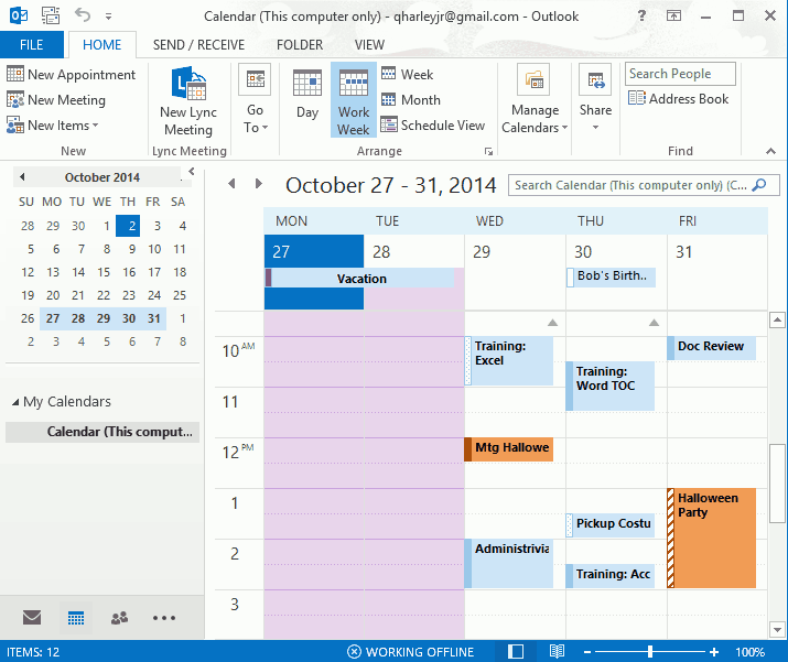
Crowded calendar giving you the blues? Automatically color calendar items by using Conditional Formatting.

Crowded calendar giving you the blues?
Good! Next, toss in some reds and the greens!
You can automatically color calendar items by using Conditional Formatting. Like Categories, conditional formats provide you with a visual method of classifying your calendar items. Once setup these formats go to work automatically, on new and previously entered items. Just assign a color to the condition (aka, criteria) you set, and whammo! Technicolor splendor!
Using Conditional Formatting to Automatically Color Calendar Entries
- View your Outlook Calendar
- On the View tab, click View Settings. The Advanced View Settings: Calendar dialog appears.
- Click Conditional Formatting. The Conditional Formatting dialog appears.
- Click Add.
- In the Name area enter a name for the view format.
- Click the Color drop-down and select a color.
- Click Condition. The Filter dialog appears.
- Edit the settings on the Appointments and Meetings, More Choices, and/or Advanced tabs, to create your criteria.
For example, to create the FYI filter, enter FYI, INFO, NOTE in the Search for the word(s) area (using commas to separate search strings). - Click OK, OK, and OK to exit dialogs and return to the Calendar screen.
Additional reading…
- Display Multiple Timezones
- Add Screenshots to an Outlook, Word, Excel, & PowerPoint
- Capture Screenshot on your mobile phone
Cheers!
hɔuᴉnb
How to create interactive charts with radio buttons and a scroll bar

Ready to take interactive check boxes further? Check out Alesandra Blakeston’s post on Interactive Charts.
..and click here to view earlier post: Automating the Spreadsheet using Check Boxes, DSUM
Occasionally you need to deal with years and years of data across multiple data sets. Seeing all of that data in one chart is distracting and difficult to read. One of the best ways to get round that (IMHO) is to add some simple interactivity to your chart.
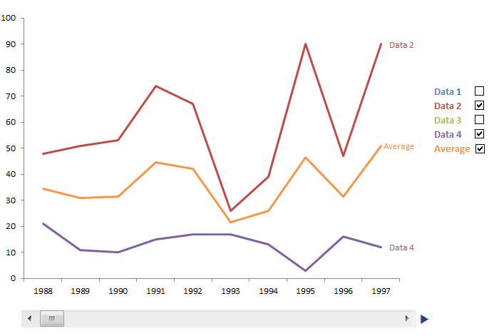 Obviously this is a static picture, but you can add scroll bars and check boxes to your excel sheet very easily. I originally learned how to do the check boxes from Peltier Tech, the scroll bar I worked out for myself after seeing how the radio buttons worked, though I am sure he’s got the how to on there as well.
You can download the sample worksheet here.
Step 1: Prepare your data
First you need to work out what time range you want the chart to show. I chose ten years, but you can set (almost) any time range you want.
View original post 1,058 more words
